Research for personal branding
I have start researched about personal branding with CV, business card and personal blog.
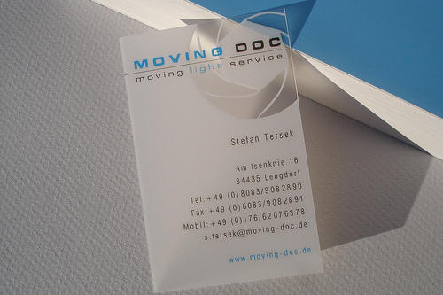
1. Colours for BC
Of all the forms of non-verbal communication, colour is the most instantaneous method of conveying messages and meanings. And colour could attract the holder's eye, convey the message of what the business is about, create a brand identity, and most importantly help to make the sale.
Much of the human reaction to colour is subliminal and consumers are generally unaware of the persuasive effects of colour.
Below are some emotional associations that people tend to associate with certain colours. These are important to keep in mind in order to create an effective business card that will appeal to the holder on a subconscious level.
Blue
Blue is often considered to be the safest global color.
Blue symbolizes peace, tranquility, stability, trust, truth, confidence, conservatism, knowledge, power, integrity, security, cleanliness, sky, water and cold.
Blue can slow the pulse rate, lower body temperature and reduce appetite. Blue is considered a business color because it reflects reliability.
- In China, blue is associated with immortality.
- For the Jewish faith, blue symbolizes holiness.
- The pharaohs of ancient Egypt wore blue for protection against evil.
- If you are "true blue" you are loyal and faithful.
Black can be seen as the color of authority and seriousness.
Black symbolizes power, wealth, elegance, sexuality, secrecy, sophistication and formality.
Black is one of the most mysterious colors and often evokes feelings of class and elegance.
- Native Americans associate black with the life-giving soil.
- If a business is "in the black" it is making money.
- Black is associated with sophistication and elegance. A "black tie" event is formal.
- The ancient Egyptians believed that black cats had divine powers.
Green
Green is one of most-often cited favorite colors.
Green symbolizes nature, environment, health, luck, money, youth, vigor and generosity.
Green is a healing color, the color of nature. It is often worn in operating rooms by surgeons.
- Ancient Egyptians colored the floors of their temples green.
- In ancient Greece, green symbolized victory.
- Green has become the symbolic color of environmentalism.
- When "all systems are green," it means everything is in order.
Orange
Orange is a fun and playful color, not to be used to convey a serious message.
Orange symbolizes balance, warmth, enthusiasm, vibrancy is demanding of attention.
Orange, along with red and yellow have been shown to exert a measurable effect on the autonomic nervous system, which stimulates the appetite.
- In Ireland orange has religious significance (Protestant).
- Often used in high visibility clothing and other safety equipment and objects.
- Taste-wise, orange is connected to the sweet tang of the fruit that bears its name.
- Popular with fast food restaurants for it's appetite-appealing nature
Purple
Purple is a good color to use when targeting younger customers such as children.
Purple symbolizes royalty, power, luxury, spirituality, dignity, nobility and enlightenment.
According to surveys, almost 75 percent of pre-adolescent children prefer purple to all other colors. Purple is a very rare color in nature; some people consider it to be artificial.
- Purple robes are an emblem of authority and rank.
- Leonardo da Vinci believed that the power of meditation increases in purple light.
- Purple is said to help develop the imagination.
- Purple is a very rare color in nature; some people consider it to be artificial.
Red
Red is the warmest and most energetic color in the spectrum.
Red symbolizes passion, provocativness, excitement, dynamics, speed, strength and urgency.
Red enhances human metabolism, increases respiration rate and raises blood pressure.
- Red is the color most commonly found in national flags.
- In China red symbolizes celebration and luck and is used in many cultural ceremonies.
- In India red is the color of purity.
- For the ancient Romans, a red flag was a signal for battle.
White
White is what we see when all colors come together in perfect balance.
White symbolizes purity, simplicity, cleanliness, peace, precisioness, innocence, winter, snow, good, sterility, and marriage.
White is often used in the medical industry and is also associated with healthy foods and dairy products.
- A white flag is the universal symbol for truce.
- The ancient Greeks wore white to bed to ensure pleasant dreams.
- The Egyptian pharaohs wore white crowns.
- It's considered good luck to be married in a white garment.
Yellow
In nature, yellow is one of the most that cannot be ignored of colors.
Yellow symbolizes joy, happiness, optimism, idealism, imagination, hope, sunshine, summer, gold, philosophy, spirituality and inspiration.
Studies show that most American prefer yellows that are sunbaked and warm, such as a sunflower petal.
- In Asia yellow is sacred, and imperial.
- In India, yellow is the symbol for a merchant or farmer.
- A yellow ribbon is a sign of support for soldiers at the front.
- To holistic healers, yellow is the color of peace.
2. Special materials
Apart from common business cards made of paper/card there are also special business cards made from plastic (PVC), especially frosted translucent plastic, crystal clear plastic, white or metallic plastic. Other extraordinary materials are metal, rubberized cards, rubber, magnets, poker chips, wooden nickels, and even real wood. For the most part those special material business cards are of standard format, sometimes with rounded corners. These new materials are popular among companies that wish a unique and eye-catching look.
There are some BC patterns I have collection.
Conqueror paper
This paper also better than normal paper I think.
Hot stamping (bronzing)
It could be make the pattern texture clearly and having variously colours. And these cards could be wearing-resistant and weather resistance.
Hot stamping used to logo, business name, people name or pattern have the effect that make the finishing point and make the theme points stand out.
Patterns of raised
The printing for a raised inked surface that could be have visual quality and high quality with touch.
PVC cards
It is waterproof and resists soiling. And the quality higher than made of papers. Good for inkjet printer. Vivid colour and high resolution photo quality.
Make the card personalization and high glossy, water resistant with tight and smooth card edges.
If make a protecting films on each surface of the finished card, it could be prevented the cards from damaging. After tearing off the protecting film, the PVC card will show a bright and glossy outlook.
But I think it have a disadvantage that it just can be printed on one side.
3. Template of CV - STRUCTURE
Name and contact details
A CV need write name as a heading. Give full address, e-mail, telephone/fax numbers, mention an answering machine if have one, and good times to contact. Make it as easy as possible for the recruiter to find.
Key achievements
Next List three to six key achievements. Write these in terms of things have done, using positive words such as completed, created, organized. If have no job history, then relate the achievements to education, leisure activities, or vacation jobs. Where possible, relate the achievements to the likely requirement of the jobs for which applying.
Career history to date
List job history in reverse chronological order, with the most recent job first. For each item focus on achievements, skills and competencies, where possible giving examples of what have done.
Education and Qualifications
List education and qualifications, from A Levels onwards, in chronological order.
Additional skills
Here list any skills which are not apparent from the above information, such as computer skills, or languages, which might be of interest to a potential employer.
Interests
Include a few interests or leisure pursuits, but not too many, and try to include some activities which have skills transferable to the workplace.
4. 10 Useful Tips for A Great Résumé Design
In order to achieve a great, compact and beautiful CV.
Make It a Summary
Keep It Simple and Understandable
Leave Some Details Out
Make It Perfect
Use a Grid
Make It Printable
Matches the paper size for your country (letter size for the US and A4 for the UK, for example), so that employers don’t have to make any adjustments before printing,
Has a white background.
Looks okay in black and white.
Will print well at 300 dpi. The best way to avoid a pixelated result is to create a PDF with embedded fonts.
Link to Online Projects
Don’t Use a Template
Update it often
Show Personality
5. There are some CV I have been researched for different layouts and formats.
READ MORE...